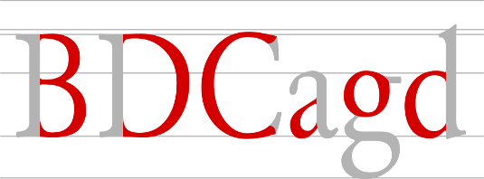
What is Typography?
Today we are going to discuss about What is Typography and basic Rules about Typography. Typography is an Art.
What is Typography?
Typography is the visual segment of the composed word and also second language communicating on the real words. The real content is the thing that you say, however typography is the first introduction of how you say it.
The term typography is like wise connected to the style, arrangement, and appearance of the letters, numbers, and symbols created by the procedure. Typography is the work of typesetters, compositors, typographers, graphic designers, art directors, comic book artists and who has knowledge about design and arrangement about word letters, numbers and symbols. Typography is useful for letter design, application, documentation, newspapers, magazines and presentation.
Typography Basic Rules for Beginners Typography:
- Font: Use a professional font. Don’t mix more than two font.
- Alignment: Alignment is an extremely important concept in typography.
- Space: Line Spacing 120-145% of the point size and use only one space.
- Use text in bold and italic. Put text in center only.
- Use correct Trademark and Copyright.
- To create effective and attractive typography, study some existing examples.
- Use basic Grid skills. Grid helps design look clean, clear and effective.
- Colour is a powerful tool for design, so the use of correct colour palette would be an important step in all design.
- Don’t Use all Caps- Don’t use all caps in text blocks longer than one line of text.
- Pass on Small Caps- If you don’t have any real small caps fonts completely pass.
- Target your audience in your design.
Being conscious of these rules can improve nearly everything you create that contains a headline or major typographic element. Let’s get started!

